Sunday, September 13, 2015

Bye Bye Blogger

This blog is out of date...

It was a hard decision but there were too many things which are so much easier with other tools.

If you wanna move on with me than click on this link below to visit my main blog! Of course I took my work I posted here with me and you can find them there too!

www.maren-steinlen.de

Heavy Gandalf (Lord of the Rings)

Saturday, September 12, 2015

Heavy Gandalf (Lord of the Rings)


Tutorial: Patterned Wallpaper

Friday, September 4, 2015

Tutorial: Patterned Wallpaper

Today I'm gonna show you a quick random wallpaper which you can reproduce very easy.


Time: 20min  
Software: Adobe Illustrator (& Photoshop if you want)
Textures: cgtextures.com

Maybe you remember my isometric landscape tutorial. This is the same pattern and I used it because of the interesting result you get when you use it with colors!

For those who didn't open the link above: how to create the bricks?
  1. Draw a square and rotate it to 45 degrees. 
  2. Scale it to the half size of the original square. Don't scale it evenly - compress it like in the image below. 
  3. Duplicate it to get the basement and pull it down until the lower angle meets the upper angle of those two squares (the lower one is just for orientation you can delete it later like me). 
  4. From here you can draw rectangles for the side walls like in the first part of the image below.

Now it's time to choose colors. I wanted to have some bright and crazy colors:
Dark Blue: #000AD4 ; Bright Blue #00E9C4 ; Pink #FF3FC6.

Time to duplicate your brick. Make sure you selected view>snap to point or better view>snap to grid to not to get some distances between your bricks.

If not there is a trick to get your points exactly on the others:
Switch to outline view with pressing strg+y. Mark all points you wanna merge with the anchor tool (press A). Right click an choose average>both. All points are on the same now!

Duplicate groups of bricks and you will get a very nice pattern which you could use as a wallpaper or as a 'material design' like me on a snowboard.
I used this wooden texture to get a bit more structure in my wallpaper. Just play around with the photoshop blending modes of the wooden texture to let it shine through!


Ghibli Pixel Characters

Saturday, August 29, 2015

Ghibli Pixel Characters

Yesterday evening I had some fun with this lovely pixel characters.
Do you know them all?

Preview: My next post will be about 'material design'... I got up that early today just because of this idea :D Stay tuned if you wanna know what this will be!
How to color a Character - Howard

Friday, August 21, 2015

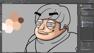
How to color a Character - Howard

As most of you will know - I don't like drawing / painting digital that much because I need so much time to get an artwork finished with a tablet...
BUT! I tried it again and I think this is worth to show it. I'm very proud! :D

Of course I am not perfect but I can show you how it works basically.

Time: 1.5 hours  
Software: Adobe Photoshop  
Brushes: Standard Brushes 100% Hardness (except for smudge tool)
Tablet: Wacom Bamboo Pen (3rd Generation)

If you're a beginner in drawing you could do it like me: put your outlines on top of your colors.
>> It was very difficult for me to draw hard edges which look natural so I decided to let the comic outlines visible.

1. Choose a basic color. For the skin of Howard I chose a bright skin tone.

2. Add four more colors: Two brighter ones for the sunny side of the skin and two darker colors for the shadows. To get more detail you can add extremely dark or bright colors, too, for extra highlights.

3. Color the whole skin with the basic color first and don't let anything uncolored!


4. Choose the first darker color and add the dark parts - choose the first brighter color to add the lights. Add them roughly, you will get into detail later. Draw some kind of gradient by changing the opacity of the used colors to 40% or 50% and change the brush size if you want a smaller/larger gradient.


5. Now take the last two colors and add some highlights like really dark parts at the ear or the hair line. Bright parts would be at the top of the nose and eyes or at the bright side of the face.


6. The last part is to blur all of this out. I used the smudge tool for this. First I had a large brush and smoothed all out. I added some colors again on top of the blurred face and smudged it again with a smaller brush!


I think this is a structured and easy method to color everything you want. Logically: The more colors and details you add the more realistic it will get.

It was great for me to recognize that it isn't that hard! I will try it again to get better in digital drawing :)


How to create a Ghibli Background - Marens way

Friday, August 14, 2015

How to create a Ghibli Background - Marens way

After a long time posting about my redesign I'll show you a new tutorial!


Time: 4hours  
Software: Adobe Illustrator & Photoshop  
Textures: cgtextures.com

It's about the famous Ghibli House of "Spirited Away" which I recreated in a vintage vector style. Here's the way you can do it on your own:

1. Look for a picture which you want to recreate and build the basic shapes in illustrator.


2. Create the basic shadows and some basic details like windows, doors or stones.


3. Now you have to get more into detail. It is up to you how much time you spend in this part. You can create an abstract background or you can do an absolutely realistic artwork which would look great! For me it is something in between. More abstract than realistic because I am not that patient :-P


4. Let's switch to photoshop for some nice effects and finalization: I decided to give my ghibli background a vintage/wooden look which means some wooden image as an overlay and a vignette are a must have. 
First I was looking for some textures here: www.cgtextures.com and added some grass structure exactly on the grassy part (where you can use the Magic Wand Tool). Cut out the grass where it should be and set the layer blending mode to "hard light".


5. Then I added a wooden texture all above the image and set the layer blending mode to "overlay" as well as the vignette which I painted with a smooth brush at the corners.


That`s it!
You can easily customize this tutorial by using some other textures or more details.
But what you really should keep in mind is to spend time in details when creating a background. You will need a lot of time for this but this is what makes your artwork more professional and beautiful!

Wednesday, August 12, 2015

Template integration

Good morning everybody.
I'm working on the integration of my new blogger template. So please be patient if you see any bugs or things that look strange on my blog here :)
But feel free to help and by mentioning any hints or screenshots of issues you find especially on mobile devices :D

Thanks a lot!
Have a look at my new template!

Sunday, August 2, 2015

Have a look at my new template!

Hi guys,
I just finished my template based on my mockup I did last week. I think it is more clear and well thought out now. Maybe there will be some changes in the future but this is what I'm going for basically. Next step: turn the template into a website...
I hope you like it!


How do I redesign my web presence

Saturday, July 25, 2015

How do I redesign my web presence

Good morning!


During my breakfast I decided to go some steps back! You know I'm about to redesign my web presence. First I thought it could be enough to fit the visual part of my blog to my current feeling and mood.
Of course it's not.

I want more than just a new look! I want to reach more people by impressing and inspiring them. Maybe you recognized that there are fundametal things missing on my blog. Social buttons to share my content. That's a great mistake because if people can't share and like - how can other people get to know me and my stuff? I want my blog to be something like a learning and sharing platform where people can learn from and I can learn from their feedback.

As a result I will focus on sharing things like thoughts or tutorials - and I have to give my readers the possibility to share them, too!

This is a draft of how I will restructure my blog:


Celebrity Fridays - Tyrion Lannister with Background

Friday, July 17, 2015

Celebrity Fridays - Tyrion Lannister with Background

Do you remember my illustration of Tyrion Lannister (Game of Thrones)?
I pimped him up with a battlefield in the background to give the whole artwork a little bit more life!